Wednesday, 21 March 2012

Information Graphics: Rene Magritte Museum

Here are my Information graphics pieces for the Rene Magritte Museum in Brussels. I wanted to make a non- arrow based signage system and came up with what can be best described as a life sized network diagram on the floor of the museum.  Each level has its own line leading to it, which is colour coded to the websites map colours. each line has a pictogram that corresponds to image that's iconic of that floor. I have also included exit signs which are made up from the iconic doves thus again eliminating the need for conventional arrows.
here you can see how it may look on the floor, with the highest level (purple) being on top then the middle (orange) and then the bottom level (green) underneath both layers. this indicates which level is which without any numerical symbols.


Typography unit Polypoz and Polyneg

Polypoz and Polyneg, two variants of a linear typeface i designed based on the polygons from video games. the above poster demonstrates the characters of both.

Sunday, 26 February 2012

Woodlnad, water colour and acrylic

A water colour and acrylic painting i did in school, rather proud of the shadows from the trees and the viberance of the leaves.

Wednesday, 8 February 2012

Surface Pattern College project

The goal of this project was to create six pieces which could be used as a cover or background to merchandise for whatever theme we picked. I chose Avenged Sevenfold, all of these could be used in or on the cover of their Cd's, or merchandise. Mainly due to the fact that I used the A7X yes and nose from the skull and repeated the pattern over and over in various ways to create this series of designs.

Pencil sketch

A quick five minute sketch i did at home in my spare time. I like this one mainly because you can tell its meant to be glass, even if the proportions are slightly out.

Saturday, 4 February 2012

Quick Life Drawing Charcoal

A quick life drawing I did with limited time, because of this the piece is far darker then I intended. But this has made the Piece more linear, thus targeting shape anf form rather than detail and tone.

Life Drawing charcoal "seated"

This piece came out great, with the toes being in perfect proportion and the detail on his face being just right without overpowering less detailed areas.

Life Drawing Charcoal "the chair"

This one was a challenge as the model was sitting in a semi slouched position which threw me to start with. however the hands, and foot detail came out great

Life Drawing Pencil

This is my favourite life drawing from college because there is a clear difference in muscle and bone structure. The tone on this piece is much more sensitive and isn't as overpowering as some of my other drawings.

Pencil Portrait

I'm rather proud of this piece, mainly due to how accurate the proportioning is and the shading.

Friday, 3 February 2012

Life Drawing Charcoal and Pastel "lying down"

This is one of my favourites. I didn't have much scope for detail so I focused on tone and the general structure of the model.

Life Drawing Charcoal "Distant"

This one was a chalenge as I had only the back and elements of his arms and face to draw, so rather than going into too much detail I tried to concentrate on tone. I personally like the tone on his back which shows his spinal structure.

Life Drawing Charcoal and Pastels

I love how this one has turned out, in particular the facial expression and the difference in light and dark. on the body and leg.

Life Drawing Charcoal "goddess"

For this charcoal drawing I had to draw the model with a mixture of clothed an non clothed sections. This proved quite a challenge at the time but I love the outcome.

Life Drawing Charcoal male 1

A life drawing from one of my classes in college. I tend to go for detail rather than shading as shown here. Im quite Proud of this one as I got the proportions and the foot almost spot on.

Tuesday, 31 January 2012

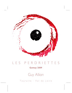
College graphics project: Wine label


Here is my design for a college graphics unit I recently did. The breif was to re-design a wine label for Les perdriettes wine (the Partridges). My wine label represents the pinky red rim of the wine and the similarly red rim of the partridges eye that live in the vineyard. I made the eye by printing with the bottom of the wine bottle with red paint and spinning it, creating this textured, feathery spiral. I then did the same with a hollowed cork and enhanced them both on photoshop by removing small imperfections. I made the type more opaque as I didn't want it to distract from the main image. Overall one of my favourite outcomes from college.

P.S. the lines in the corners are the boundries of the label, I will replace this picture a cropped, higher quality picture in the coming days along with images of the label on the bottle.

Friday, 6 January 2012

Final Sight

A wasteland with a mysterious handprint in the foreground with an ominous blood red sky sweeping overhead.

Sea Domes WIP

A recent seascape with floating city domes and sandstone islands.

Thursday, 5 January 2012

Pink Skies WIP

An ocean world with a misty horizon and glistening icebergs overlooked by a nearby planet. I intend to add larger icebergs in the backdrop moving out to the horizon.

Pink destroyer

A surreal Bryce image I made with an open ocean and the pink dotted sky.

My Inspiration

A link to my late Grandfather, Peter Sharpe's website. The man who inspired me to do 3D art and who introduced me to the program Bryce. His website includes pieces on Bryce, Photoshop, xenodream and some photography as well as tutorials http://www.penrhyn.net/index.html 

Below is an example of his work, The Midas Touch.

Aqua Planet

A very surreal alien world where domed cities float among giant plants emerging from the unending sea.

Migrating dragons WIP

A small group of dragons migrating through an eerie misty landscape.

Beneath

An ominous light highlights a strange structure emerging from the depths under the night sky.

Hidden Cities

Two cities protected by a wall of glass and a metallic cage set in rocky desert with an oncoming sandstorm.

test post

Testing my blog out